Analytics
The Analytics page provides deep reporting on your CRM pipeline. It displays an overview KPI row, six charts covering different aspects of pipeline performance, and a ranked leaderboard of top performers. All charts respond to the global date range and owner filters at the top of the page.
Accessing the Page
Section titled “Accessing the Page”- Route:
/analytics - Menu Path: CRM → Analytics
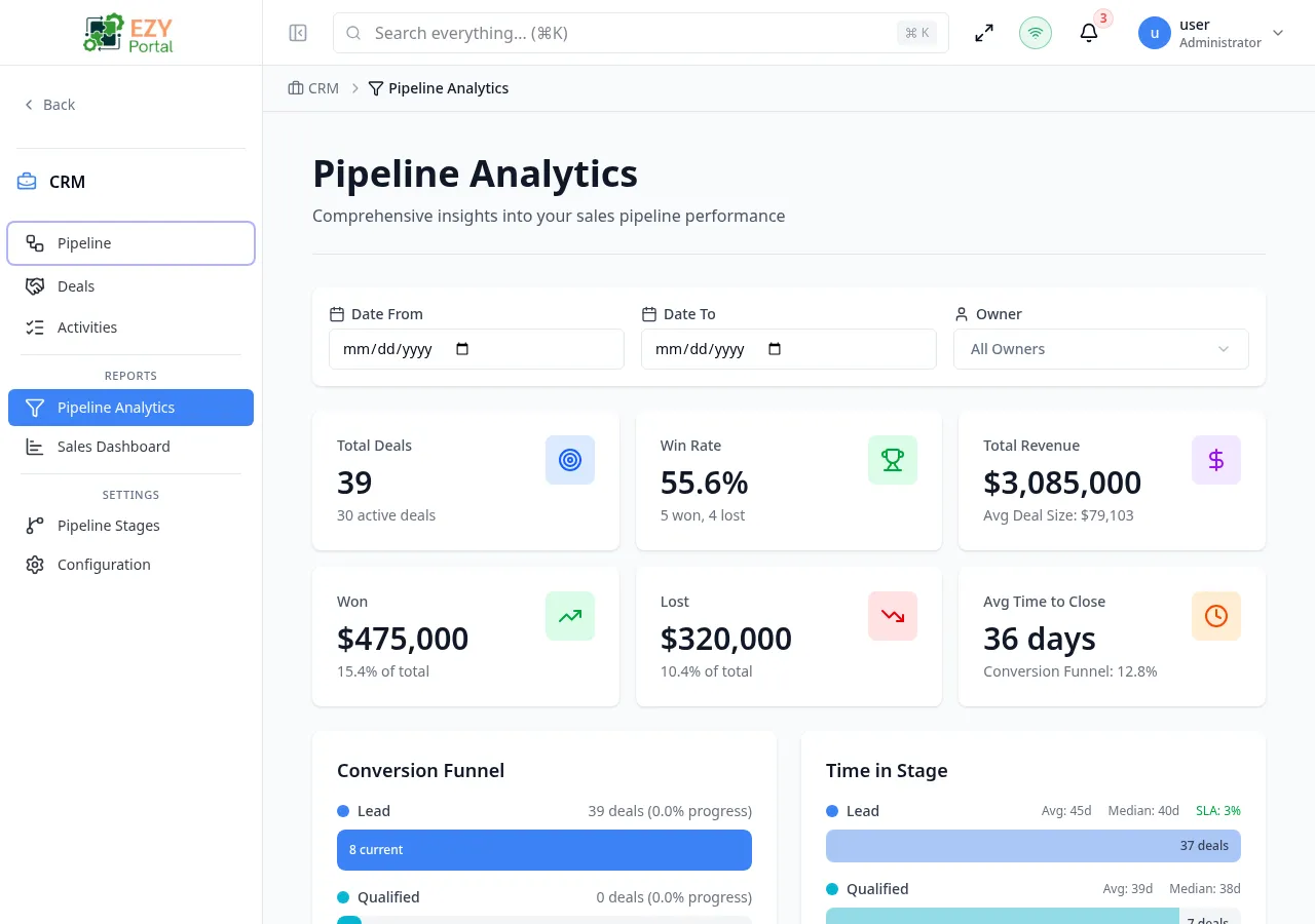
Filters
Section titled “Filters”A filter bar at the top of the page controls all charts and tables.
| Filter | Type | Description |
|---|---|---|
| Date From | Date | Start of the analysis period |
| Date To | Date | End of the analysis period |
| Owner | User select | Filter by deal owner; defaults to all owners |
Click Apply Filters to reload all charts with the selected criteria.
Dashboard sections
Section titled “Dashboard sections”Overview KPI Cards
Section titled “Overview KPI Cards”A row of six summary cards provides headline metrics for the filtered period.
| Card | Description |
|---|---|
| Total Deals | Count of all deals in the period |
| Active Deals | Deals currently open |
| Win Rate | Won deals ÷ (Won + Lost) as a percentage |
| Avg Deal Size | Average value across all deals |
| Avg Time to Close | Mean days from creation to Won status |
| Total Revenue | Sum of Won deal amounts |
Conversion Funnel
Section titled “Conversion Funnel”A funnel chart shows how many deals entered each stage and what percentage converted to the next stage. Each bar shows:
- Stage name
- Deal count for that stage
- Conversion rate to the next stage (e.g., “45% conversion”)
Use this chart to identify where deals are stalling in the pipeline.
Time in Stage
Section titled “Time in Stage”A horizontal bar chart shows how long deals spent in each stage on average. For each stage:
- Average days
- Median days
Stages where deals sit longer than expected indicate friction or bottlenecks.
Win/Loss Analysis
Section titled “Win/Loss Analysis”This chart breaks down Won and Lost deals:
- Win rate percentage
- Count of Won and Lost deals
- Loss Reasons section listing the most common reasons deals were lost
- Win Reasons section listing the most common winning factors
- Monthly trend line showing Won vs. Lost over time
Loss and win reasons are sourced from the reasons entered when marking deals as Lost or Won.
Revenue Forecast
Section titled “Revenue Forecast”The forecast chart projects expected revenue using three scenarios:
| Line | Description |
|---|---|
| Weighted | Deal amount × probability for each open deal |
| Best Case | Total amount of all open deals (100% close rate) |
| Worst Case | Only deals at 70%+ probability |
A stage breakdown table below the chart shows the forecast contribution from each stage.
Activity Trends
Section titled “Activity Trends”A multi-series line chart plots weekly or monthly activity:
| Series | Description |
|---|---|
| Deals Created | New deals opened per period |
| Deals Closed | Deals moved to Won or Lost per period |
| Revenue | Revenue from Won deals per period |
Use this chart to spot seasonal patterns or the effect of sales campaigns.
Top Performers
Section titled “Top Performers”A ranked table lists the top-performing sales team members for the filtered period.
| Column | Description |
|---|---|
| Rank | 1st, 2nd, 3rd… with trophy icons for top three |
| Name | Team member name |
| Deals Won | Count of Won deals |
| Revenue | Total revenue from Won deals |
| Win Rate | Won ÷ (Won + Lost) |
| Avg Deal | Average deal size |
Permissions and role visibility
Section titled “Permissions and role visibility”All authenticated CRM users can access the Analytics page. Data is scoped to the user’s accessible deals — region-restricted users see only deals within their scope.
Common tasks
Section titled “Common tasks”- Open CRM → Analytics from the sidebar.
- Set a date range using the Date From and Date To filters, then click Apply Filters.
- Review the Conversion Funnel to identify the stage with the highest drop-off.
- Check the Win/Loss Analysis to understand why deals are being lost.